Skip to main content
Search
Search This Blog
Art Speaking
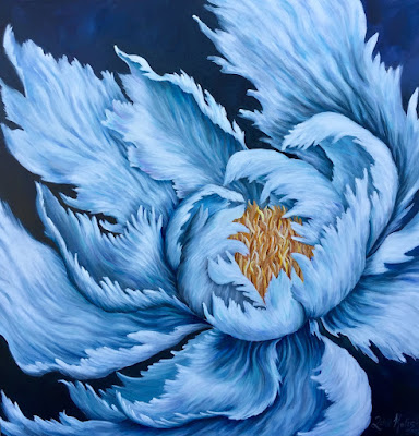
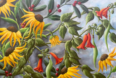
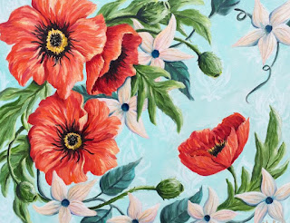
ART SPEAKING: The Floral Paintings of Julia Kulish
Posts
Featured
February 23, 2018
WE'VE MOVED!!!! Find the latest blogpost at www.juliakulish.com
Latest Posts
January 29, 2018
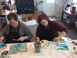
The Studio Doors are Open
August 23, 2017
My Very Bones ...
June 30, 2017
Commissioned Artwork
May 26, 2017
March 27, 2017
My Hand in a Little Bit of Everything
September 07, 2016
Summer's End
July 26, 2016
Wild Things
July 21, 2015
I Hope You Always Wear Flowers in Your Hair
July 02, 2015
On Fire
February 01, 2015
"The Hopes of Anne Bradstreet"
Older Posts